How I Built a $1k-Quality Landing Page With Codex and a Few Tools
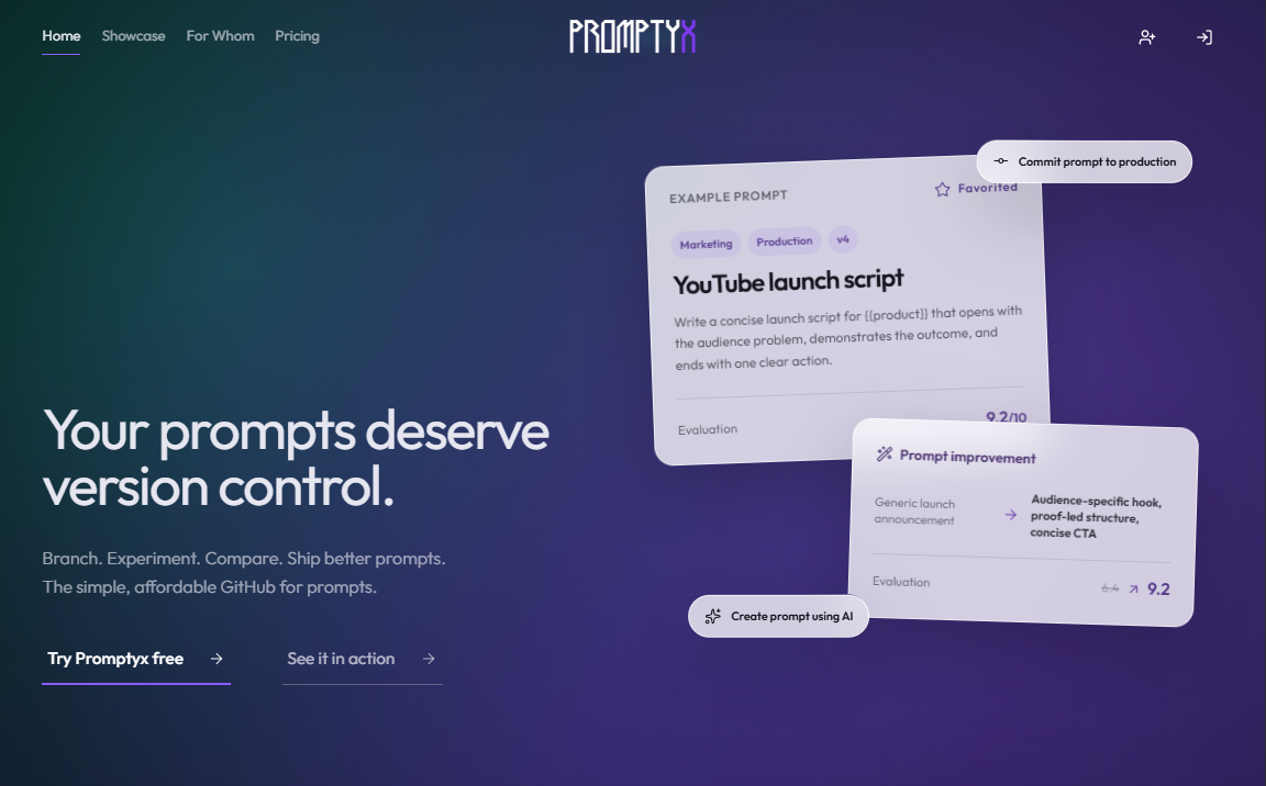
I started with a blank codebase.
About a week later, I had a fully implemented landing page with shaders, 3D models, custom interactions, responsive layouts, and mobile Lighthouse scores above 90 in three out of four categories.
Here is the funny part: I am not a web designer. I am a 15-year-old developer with no experience in web design, UI design, or UX design. No design degree, no agency background, no secret decade spent adjusting Figma frames. Just a simple teen boy who likes building things and had a very clear idea of what the page should feel like.
The stack was Vanilla JavaScript, Tailwind CSS, Codex, and a few useful tools and skills. The only paid requirement was a $20 ChatGPT Plus plan.
The page is not public yet, but the design has now been ported into the real production system. The visual implementation survived the move; only the main marketing copy changed. This is the process that got me from an empty directory to that result—not a victory lap for an already-launched website.
And no, I did not type “make a $1,000 website” and return five minutes later to find a tiny design agency living inside my computer.
The actual workflow was:
Context → Plan → Mock up → Improve → Implement → Inspect → Test → Optimize
What I built
The main project was a new landing page for Promptyx, an AI prompt-management and engineering platform.
Promptyx helps people store, organize, version, experiment with, and analyze prompts. Its landing page needed to communicate a lot without looking like an enterprise dashboard had exploded across the screen.
My direction was simple: premium but affordable, approachable for beginners, strong enough for advanced users, conversion-focused, and visually memorable without turning every section into a graphics benchmark.
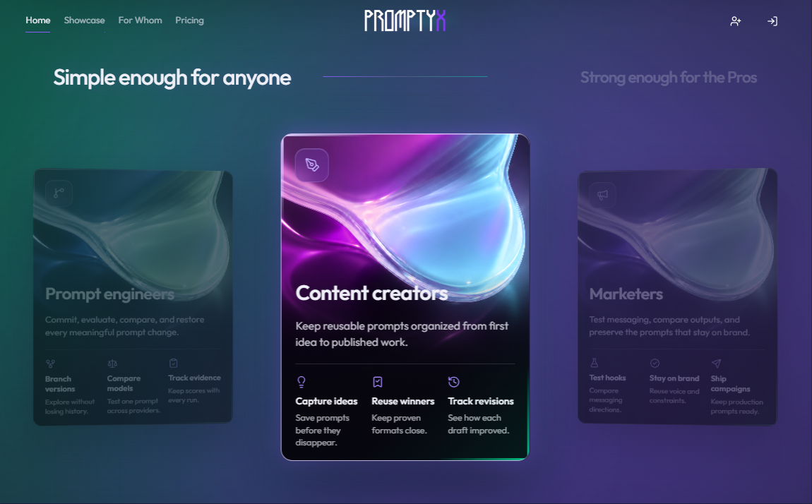
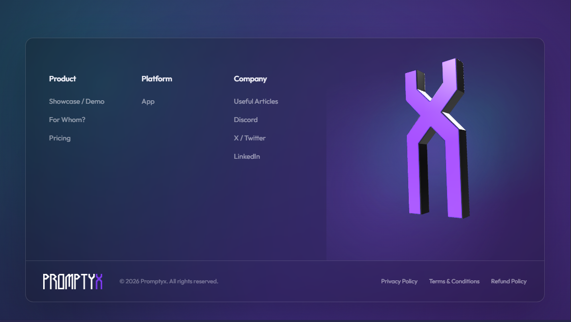
The design includes shaders, 3D elements, motion, product-focused cards, and responsive interactions.
Watch the full interaction recording.
I also tested the process on completely different directions for my own site:
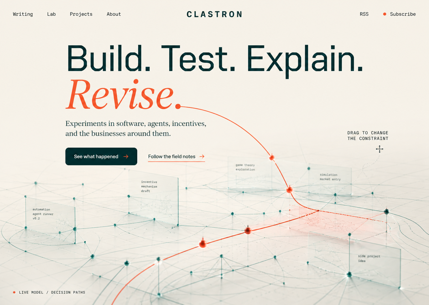
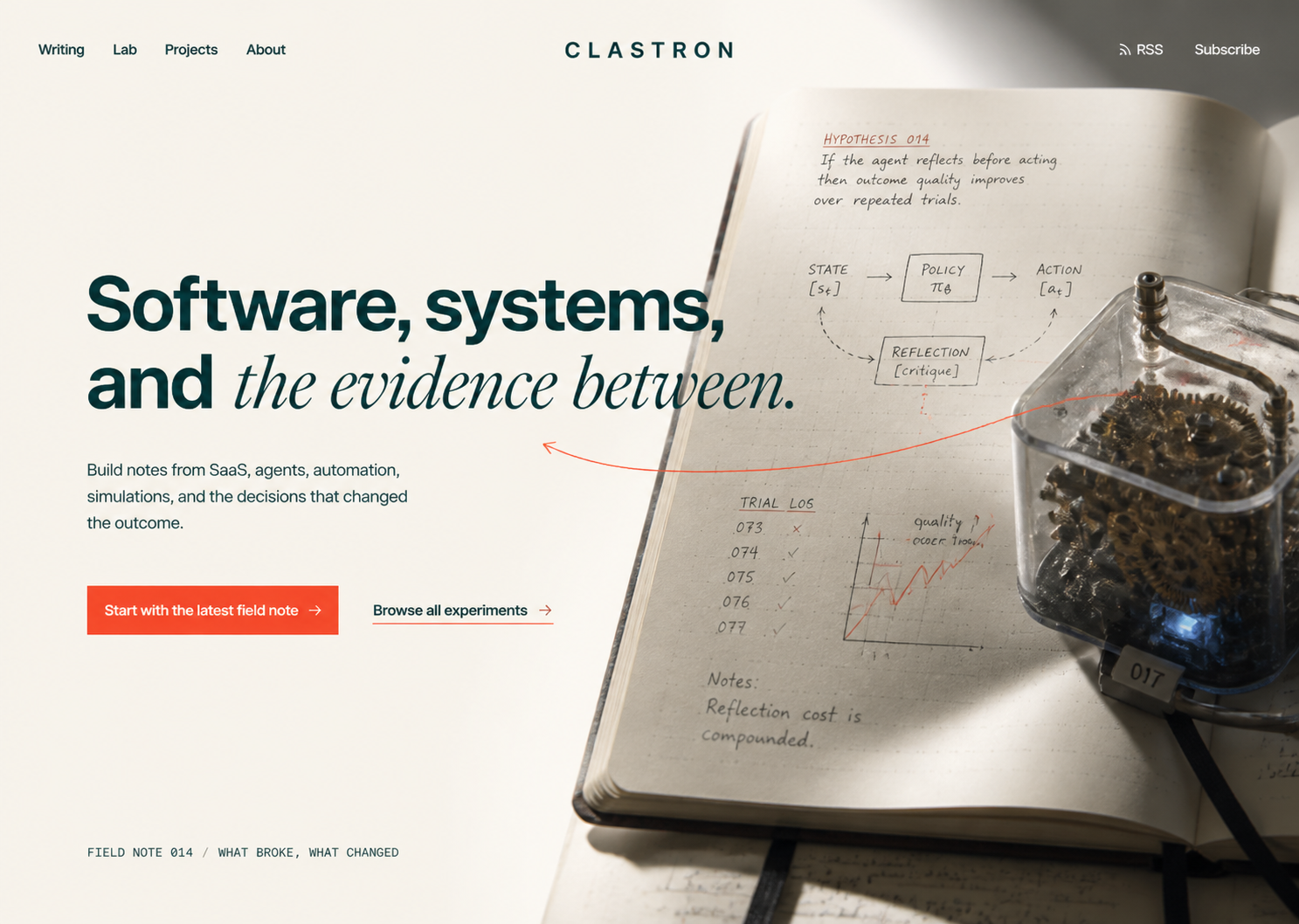
That matters because the workflow was not trapped in one glowing-purple SaaS style. It could move toward an editorial laboratory while staying intentional.
Is it really worth $1,000?
I did not sell this exact page for $1,000, and I am not claiming it produced $1,000 in conversions. The number is an estimate of what a comparable finished deliverable could cost.
Upwork currently places responsive landing-page design around $300–$1,500 and a full landing-page system with design, build, reusable components, and handoff around $750–$2,100. WebFX gives a wider market range of $75–$3,000+, including $1,125 for its responsive template-based option and $3,000 for a fully custom page. Sources: Upwork's web-design guide, Upwork's landing-page guide, and WebFX's 2026 pricing guide.
A screenshot alone is not worth $1,000. But this was a custom responsive implementation with an original direction, real product imagery, 3D, shaders, interaction, multiple revision rounds, accessibility work, performance optimization, automated checks, and a production-integration plan. On that scope, $1,000 is a reasonable—and arguably conservative—comparison, although it is still not an appraisal or revenue claim.
So “$1k-quality” is a market comparison—not money I earned and definitely not a price handed down by the website gods.
Setup: give Codex somewhere useful to start
This part deserves more attention because the setup shaped everything afterward.
1. Prepare the codebase
I created an isolated prototype directory inside the real Promptyx codebase and set it up with Vanilla JavaScript and Tailwind CSS. The isolation mattered: Codex could experiment without touching the live homepage, backend, routing, or production data. Before visual work, I made sure it could inspect the repository, run the page, use the browser, and verify changes.
The safe structure was deliberately boring:
``text project/ ├── AGENTS.md ├── Important Files/.codex/ │ ├── current_task.md │ ├── system_architecture.md │ ├── branding.md │ └── redesign.md └── App/frontend/staging/home/new_home/ ``
The prototype directory was the only place where the design could change. There was no clever initialization command beyond running the local project and its checks; the protection came from boundaries Codex could understand.
2. Add the design tools
I enabled:
- Codex as the main coding agent and working environment;
- GPT Taste for composition, typography, motion, and landing-page direction;
- Impeccable for visual critique, accessibility, responsive behavior, and final QA;
- Product Design for generating and comparing visual mockups;
- Canvas UI for liquid, Asciify, and interactive 3D experiments;
- Shaders.com and its package for animated shader treatments and visual exploration.
The tools were not a substitute for direction. They gave Codex better ways to explore, inspect, and implement that direction.
3. Create persistent context
The project used AGENTS.md plus persistent files for the current task, system architecture, branding, and redesign planning. redesign.md became a living brief and decision log. Together they recorded:
- what Promptyx does;
- the intended visitor and conversion goal;
- the brand personality;
- visual references and patterns to avoid;
- the stack and repository rules;
- responsive and performance expectations;
- accessibility, privacy, and security requirements;
- protected files and boundaries.
One line in the project context did a surprising amount of work:
The active implementation is staging. Treat local staging code as the source of truth. Production should mirror verified staging changes rather than becoming a separate implementation.
This made the project less dependent on one giant prompt. Codex could return to the same source of truth instead of reconstructing Promptyx from whichever message happened to be newest.
It also prevented “make it modern” from becoming fifteen glass cards and a glowing circle with no known occupation.
4. Initialize the chat
I then gave Codex the full product and brand direction, shared inspirations, asked it to inspect the repository and available tools, and told it to write the complete plan before editing. When the first task's context eventually became huge, I started a second task that reread those files and treated the existing page as its approved baseline.
The useful information was not a collection of magic words. It was product context:
Promptyx is an AI prompt-management and engineering platform. It should feel simple enough for anyone, strong enough for professionals, premium but affordable, and focused on getting visitors to try the product.
Here is the useful core of my real initialization prompt, shortened and stripped of local paths:
Read
AGENTS.mdand the required context first. Inspect the existing product and branding, then write the complete redesign brief before editing. Work only inside the isolated homepage directory. Preserve the brand, routes, and existing product truth. Use the available design skills, verify each stage, and do not touch production.
Codex turned that into a staged plan: document the direction, compare compositions, build the foundation and navbar, implement each major section, harden motion and responsiveness, then finish with browser verification and documentation.
Before publishing any prompt or screenshot, I will remove credentials, private URLs, customer information, internal dashboards, and personal data.
Choose your build route
After setup, I used one of two approaches.
One complete first pass
When the direction is clear, Codex can plan the whole page, create a complete mockup, implement it, and then revise weak sections.
A good one-shot process still has separate passes:
- plan;
- create the visual direction;
- implement;
- inspect and correct.
It is fast because you quickly get a complete page to react to.
One section at a time
For experimental sections, I prefer:
Direction → two mockups → choose → improve → implement → inspect
Two mockups make comparison easier. I can keep the composition from one, the typography from another, or reject both before spending time on code.
This works especially well for unusual layouts, shaders, 3D, and interactions. It takes longer, though. Two footer concepts can become seven, and suddenly I am running a small election for a footer.
Promptyx mostly used the section-by-section route. The hero, Showcase, audience carousel, Pricing, and Footer each went through their own direction and revision loop. FAQ and the final CTA were simple enough to complete together in a broader pass.
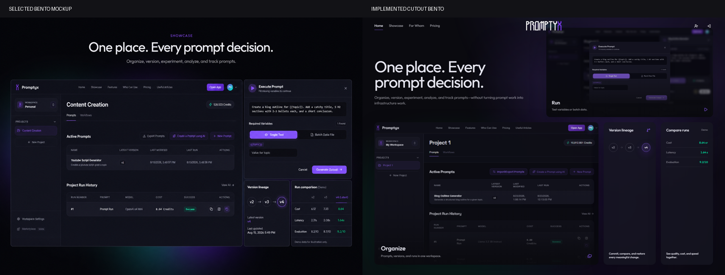
_The mockup established hierarchy; implementation adapted it to real product screenshots, a header cutout, and the actual responsive grid._
The real loop: design, implement, inspect
The Promptyx hero needed to explain the product quickly while feeling premium and approachable.
The final result pairs “Your prompts deserve version control” with floating product cards. Those cards show a prompt, evaluation, improvement, and actions. They demonstrate the product instead of placing an unrelated laptop beside the headline.
The process was:
- describe what the section needed to communicate;
- share references and constraints;
- create mockup directions;
- choose and improve one;
- implement it;
- inspect the real page;
- send the weak area back as visual feedback.
The task history preserves the turning point rather clearly. After asking for an ASCII X and a thick ribbon that wrapped around it, I eventually wrote: “It’s becoming too convoluted.” A later replacement was worse, so I asked Codex to revert to the earlier hero. The clean result above survived because reverting was treated as normal, not as failure.
Some revisions were small: spacing, hierarchy, card positioning, text wrapping, or animation. Others were gloriously less subtle. I tried an ASCII logo, a thick animated ribbon, several shader treatments, an interactive 3D dashboard, a particle-scroll effect, and an eight-part Features grid. The hero became too convoluted, so I stripped it back. One broader result looked bad enough that I requested a full revert. The Features section was eventually hidden and its job was merged into a stronger Showcase bento.
That is a more honest picture of AI-assisted design than pretending every generation was genius. The page improved because I could reject work, revert it, or delete a whole direction without becoming emotionally loyal to the hours already spent.
Screenshots made those revisions much easier. My feedback pattern was:
- crop the exact problem;
- explain what looks or behaves wrong;
- state what must remain unchanged;
- describe the desired result;
- ask Codex to inspect the relevant code and test the change.
That was faster than writing a small novel about why a card felt six pixels too emotionally distant from its heading.
Official OpenAI examples describe the same broad idea: using screenshots and visual references to build responsive interfaces, then checking and iterating on the implementation. Official Codex use cases
Final passes: make the page survive reality
Once the desktop page looked finished, responsive testing politely informed me that it was not.
Codex tested the page, and I tested it manually across different widths. I checked headline wrapping, navigation, CTAs, touch targets, floating elements, and how the shaders and 3D behaved outside a perfect desktop viewport.
The recorded browser audit used 1440 × 1000 desktop and 390 × 844 mobile views. One real failure came from desktop grid rules overriding the intended two-column mobile Showcase. After fixing the grid, the narrow comparison values still clipped, so they were stacked and checked again.
_The mobile page reorders the Showcase, keeps the audience carousel usable, stacks Pricing, and simplifies expensive effects without becoming a different design._
Then I moved through one combined final pass. Multiple live gradient fields became one shared page-level field. Shader-heavy card backgrounds became images where continuous rendering added little. The broken particle-scroll experiment was simply removed.
- compress images and 3D assets;
- reduce unnecessary JavaScript and shader work;
- use lazy loading and sensible mobile fallbacks;
- check font loading and layout shifts;
- support reduced motion;
- test keyboard navigation, focus, contrast, labels, and semantic structure;
- add titles, descriptions, canonical URLs, Open Graph, structured data, sitemap, and robots rules;
- review secrets, dependencies, forms, external assets, links, privacy, and production configuration.
The hardening pass also precompiled Tailwind, self-hosted fonts and key libraries, tree-shook the icon bundle, lazy-loaded the Three.js footer, added WebP sources with PNG fallbacks, and reduced heavy effects for low-resource devices, data-saving connections, and reduced-motion users.
The task history records about 35.7 hours of completed Codex-turn runtime across the two main homepage tasks. That is not my hands-on time—it includes automated implementation, testing, screenshots, and verification—but it shows how much machine work ran during that week.
The current Lighthouse runs look like this:
| Category | Mobile | Desktop | | -------------- | -----: | ------: | | Performance | 94 | 95 | | Accessibility | 100 | 100 | | Best Practices | 96 | 96 | | SEO (Not True) | 69 | 69 |
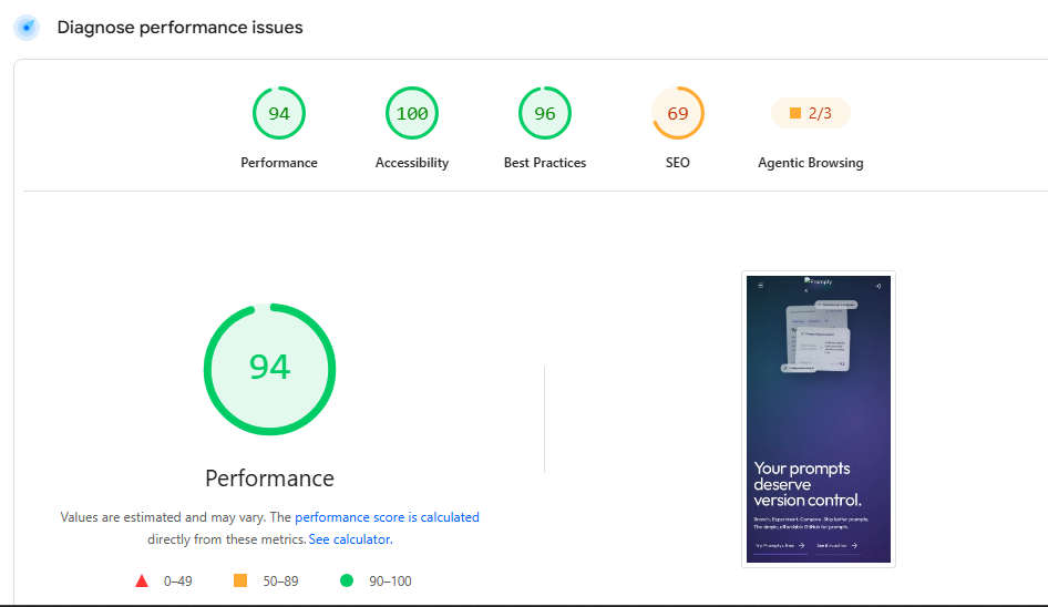
_Mobile^^_
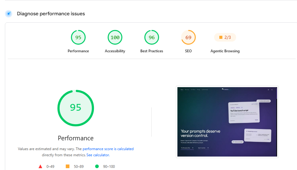
_Desktop^^_
The SEO score needs context: the tested page was blocked from indexing, so Google could not reliably discover or evaluate it as a public page. It is not evidence that the public page will score 69. These were also informal, one-time Lighthouse runs—not a median of repeated lab tests. The local production QA recorded 15 passing automated checks and found no console errors, broken images, duplicate IDs, unlabeled controls, or horizontal overflow at its tested desktop and mobile sizes.
Lighthouse is useful evidence, not a magical certificate. A high accessibility score does not prove that every user can use the page, and a performance score from one run can vary the next time.
What actually made this work
Codex made implementation, exploration, revisions, responsive work, and optimization surprisingly easy.
But it did not decide what Promptyx should feel like.
I still had to explain the product, collect inspiration, choose between directions, reject generic output, notice visual problems, decide whether an effect helped or merely moved, test the implementation, and make the final calls.
That is the strangest and most exciting part for me. I am a teenager and a complete non-designer. I had no previous web, UI, or UX design experience. Yet with clear context, a $20 plan, strong tools, and enough iteration, I could create something that looks far beyond what I would have expected from myself.
This does not mean design knowledge is useless. If anything, the project made me want to learn more. Better taste and deeper design knowledge would improve every decision in the loop.
You need a loop, not a magic prompt
Can Codex help a non-designer build a landing page that might reasonably cost $1,000 or more from a freelancer?
Based on this project, yes.
The coding became easier. Quality still came from context, visual direction, iteration, and testing.
If you want to try it, start with one real section. Give Codex the product and audience context. Ask for two directions. Choose one, improve it, implement it, and send the real result back as visual feedback.
Then repeat until the page stops lying to you about being finished.